Friday, January 26, 2007
Lake Erie Monsters coming ashore
While visiting the AHL (American Hockey League) web site tonight, I found a great new team called the Lake Erie Monsters who will join the AHL for next season.
The new American Hockey League team that will begin play for the 2007-08 season in Cleveland at Quicken Loans Arena. The Monsters will operate as the primary affiliate of one of the NHL's most successful franchises, the Colorado Avalanche.
The team name was selected after an extensive amount of research was conducted with focus groups made up of casual fans, high level hockey fans, former Cleveland pro hockey season ticket holders, and others. In addition, considerable research explored names that would have a fun connection to the region. The Lake Erie Monsters was the top preference from the focus groups.
The "legend of the Lake Erie Monster" or "LEM," brings a fun geographical folklore connection to the region. The logo art reflects the menacing, powerful nature of the creature and features the hot yellow glare of the Monster's eye. Primary team colors will be wine, blue, yellow and black.
The home jersey will be white with wine shoulders and black trim segments on the arm sleeves and will feature the secondary logo on the front. The road jersey will be wine with black and white trim segments on the arm sleeves. Both home and road jerseys will have the Monster from the primary logo on each shoulder. Player numbers will appear on each shoulder sleeve and on the back of each jersey.
Leading the design and name development process with the organization's senior management team was Tracy Marek, Cavaliers/Quicken Loans Arena senior vice president of marketing. The team worked with Cenergy Communications on all elements of the name and design development process.
"Cenergy Communications brought a great deal of specialized expertise and insight to the table for this project. They really helped us develop an identity package that we'?re confident will engage our fans-to-be with a fun, but aggressive, team image they can be proud of and connect with. Monster Hockey is going to attack The Q like no other hockey team ever has!" said Marek.
I love the name and logo, but would make one small change. I would add the word 'Lock' to their name, making them the Lake Erie Lock Monsters. I think they probably avoided this name though, as there was another team in the AHL that used to go by the name Lowell Lock Monsters. They have since changed their name to the Lowell Devils (they went from a great name and logo, to a pretty lame name and logo in my opinion).
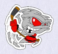
As well as the Lowell Lock Monsters, there was also a UHL team about 10 years ago called the Madison Monsters. I really liked thier logo, but their jersyes looked pretty funny as they were white with black pinstripes, which made them look like baseball jerseys instead of hockey jerseys.
While looking for the Madison logo, I also found this logo for the Vermont Lake Monsters baseball team.
It would seem that the name Monsters, is not as unique as I first thought. Uniqueness aside, I can't wait to add some Erie Lake Monsters merchandise to my collection next season!
Wednesday, January 24, 2007
10th Anniversary Logo Survey
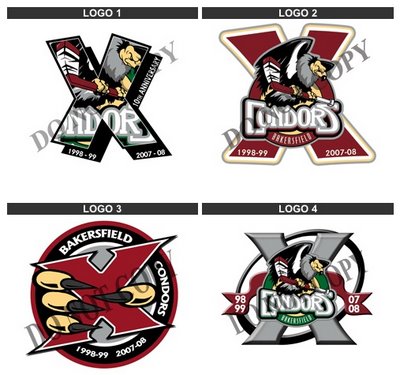
Tonight while surfing the net, I visited the Bakersfield Condors web site and noticed they were going to be celebrating their 10th anniversary next season. To celebrate, they had a contest to vote for the logo they would use during their 10th Anniversary season. There were 4 logos to choose from. I always love seeing the logo choices, and then seeing which one ends up being used.
Of the four choices, I would choose logo #3. I love the claws grabbing the large ten "X". I would like to see them make the claws look a little more 'rough' as they look in their actual logo. A few claw marks on the "X" would look good too! Second choice would be logo #2. This one looks good, but the "X" in this one gets a little lost. It would look better if they had used the same "X" from logo #3 for this one. I do not like logos #1 or #4. Both are a little too busy and I don't think they would look very good on a jersey, when you see it for a distance.
As far as which one will win, I am putting my money on #3.
While we are discussing the Condor's logo, here is their original logo, back when they were known as the Bakersfield Fog. This is one of my all time favorite logos. I even have a Fog jersey in my collection. When I emailed them to ask why they had changed their name/logo, they told me that they changed their name due to the bad connotations that were linked with the name Fog, due to the fact that Bakersfield is known for its dense fog, and that many people have been killed due to the fog. Too bad, because this is such a cool logo and name!
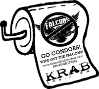
And lastly, something else I found on the Condor's site. A piece of merchandise that I have not seen a hockey team sell before... toilet paper! The product details on the web site state: "This is a roll of toilet paper that has the Fresno Falcon's logo on it and says 'Wipe out the Falcons.'" I wonder if the Falcons have Condor's toilet paper for sale on their site?
Sunday, January 14, 2007
The Original "Battle of Alberta"
Before the NHL set up shop in both Calgary Alberta and Edmonton Alberta in the 80's, there was the Calgary Stampeders and Edmonton Eskimos of the CFL. This was the original "Battle of Alberta"
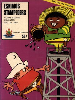
While perusing a used shop a couple of years ago, I spied this great cover in a glass case and had to have it! What 'it' was, a CFL (Canadian Football League Edmonton Eskimos game program from August 23, 1965. The game was between the Edmonton Eskimos and the Calgary Stampeders. I loved the cover illustration depicting an Eskimo at the top of an oil rig, about to pour a what looks like a bucket of crude oil down onto a quickly approaching cowboy. A great illustration, which somehow seems inappropriate by today's 'way to politically correct' standards.
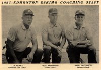
As well as the cover, there are also some great ads etc inside. The first is a picture of the 1965 Edmonton Eskimo coaching staff. I noticed two things. First off, the combined age of these three looks to be well over 200! And second, I did not realize that just 4 years before landing on the moon, Neil Armstrong was coaching a Canadian Football League team in Edmonton.
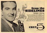
There is an ad for CBXT Channel 5's coverage of all things Eskimos and CFL. Being the sports play-by-play junkie that I am, I loved the ad
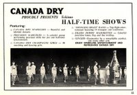
Next up, is an ad proudly presenting the Canada Dry half-time shows, featuring; Canada Dry Sparklers - beautiful and talented dancers, precision Marchers - a colorful group performing precision drills for pre and half-time entertainment, Canada Dry Champange Girls - 50 marching and dancing girls, "Swinging Brass" Band - top flight entertainment featuring 14 trumpets and trombones, "Eilen Dodds" Majorets - colorful precision baton, flag and fire twirling, Ginger-Gymnastics by a remarkable acrobat, and many other acts. Wow... what fun. Don't bother heading off to the snack bar lineup or the bathrooms!
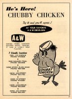
There is a full page ad for A&W's Chubby Chicken. This has nothing to do with football, but I'm a huge fan of the old A&W Drive-Inn restaurants and I love the name "Chubby Chicken", and the great logo that goes along with it. If you read the ad, it would seem that the little chicken mascot's name is actually "Chubby Chicken". Again, I doubt that this would have been created as a promotional character today with all our politically correctness.
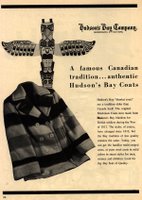
Lastly, is an ad for the Hudson's Bay Company, and their "famous Canadian tradition... authentic Hudson's Bay Coats". I guess this sort of relates to CFL football, as the stadium in Edmonton is outdoors and you would free your backside off in November watching the Eskimos, so a "blanket coat" would be a must!
As a fan of logos and slogans, I always liked the promotional campaign of the late 90's which stated "The CFL - Radically Canadian!"