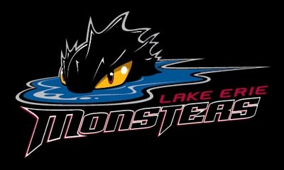
While visiting the AHL (American Hockey League) web site tonight, I found a great new team called the
Lake Erie Monsters who will join the AHL for next season.
The new American Hockey League team that will begin play for the 2007-08 season in Cleveland at Quicken Loans Arena. The Monsters will operate as the primary affiliate of one of the NHL's most successful franchises, the Colorado Avalanche.
The team name was selected after an extensive amount of research was conducted with focus groups made up of casual fans, high level hockey fans, former Cleveland pro hockey season ticket holders, and others. In addition, considerable research explored names that would have a fun connection to the region. The Lake Erie Monsters was the top preference from the focus groups.
The "legend of the Lake Erie Monster" or "LEM," brings a fun geographical folklore connection to the region. The logo art reflects the menacing, powerful nature of the creature and features the hot yellow glare of the Monster's eye. Primary team colors will be wine, blue, yellow and black.
The home jersey will be white with wine shoulders and black trim segments on the arm sleeves and will feature the secondary logo on the front. The road jersey will be wine with black and white trim segments on the arm sleeves. Both home and road jerseys will have the Monster from the primary logo on each shoulder. Player numbers will appear on each shoulder sleeve and on the back of each jersey.
Leading the design and name development process with the organization's senior management team was Tracy Marek, Cavaliers/Quicken Loans Arena senior vice president of marketing. The team worked with Cenergy Communications on all elements of the name and design development process.
"Cenergy Communications brought a great deal of specialized expertise and insight to the table for this project. They really helped us develop an identity package that we'?re confident will engage our fans-to-be with a fun, but aggressive, team image they can be proud of and connect with. Monster Hockey is going to attack The Q like no other hockey team ever has!" said Marek.

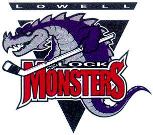
I love the name and logo, but would make one small change. I would add the word 'Lock' to their name, making them the Lake Erie Lock Monsters. I think they probably avoided this name though, as there was another team in the AHL that used to go by the name Lowell Lock Monsters. They have since changed their name to the Lowell Devils (they went from a great name and logo, to a pretty lame name and logo in my opinion).

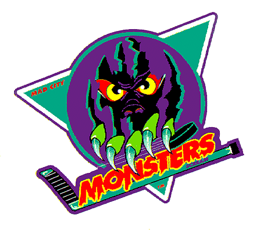
As well as the Lowell Lock Monsters, there was also a UHL team about 10 years ago called the Madison Monsters. I really liked thier logo, but their jersyes looked pretty funny as they were white with black pinstripes, which made them look like baseball jerseys instead of hockey jerseys.

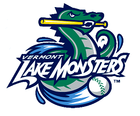
While looking for the Madison logo, I also found this logo for the Vermont Lake Monsters baseball team.
It would seem that the name Monsters, is not as unique as I first thought. Uniqueness aside, I can't wait to add some Erie Lake Monsters merchandise to my collection next season!